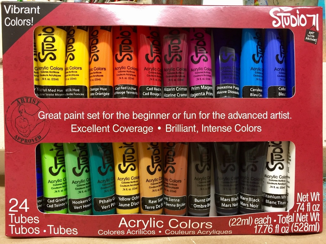
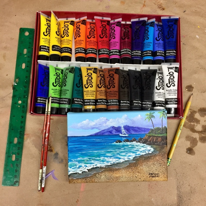
I found the colors to be very similar to the brands I normally use. The color labels varied just slightly from what I'm use to. Instead of "Lemon Yellow" or "Pthalo Blue", Studio 71 calls these "Primary Yellow" and "Primary Blue", that's not to big of an issue for me.
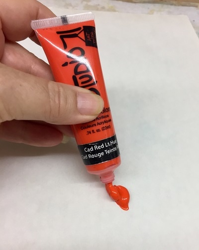
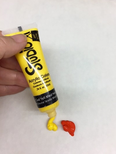
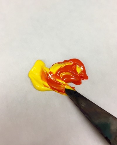
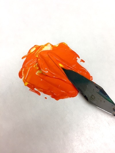
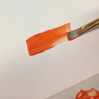
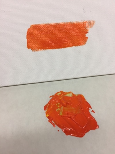
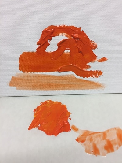
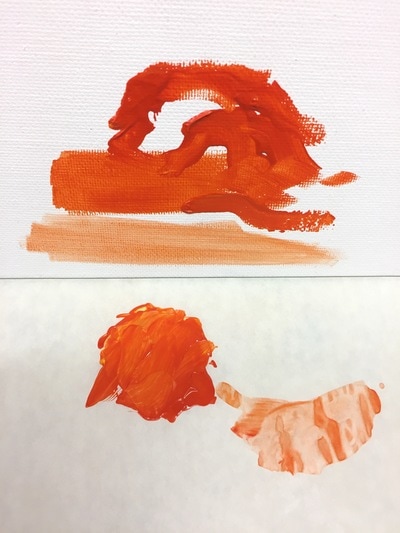
The paints are medium bodied, not to thin and not to thick. Very similar to Winsor & Newton Galeria acrylic, the brand I use most often. In the following photos I show you what they look like when you squeeze them from the tube, how well they blend together and how well they cover the canvas. Click on each photo and read the captions.
Happy painting!


 RSS Feed